 I've been accumulating some usage and usability patterns for some time (mostly for IT Mill Toolkit, but the ideas are pretty generic, I think), and it's time to start purging the backlog.
One might say that these are "patterns" in two ways: as a way of using components, and in a broader sense as usability/user interface patterns. Hopefully these examples, although simple, will inspire and show some possibilities you might not have thought of.
Some of the components in IT Mill Toolkit are very versatile, and some possibilities might not be immediately obvious. It's possible to create very (re)usable "patterns" just by configuring a component into a certain mode, adding a little CSS, or just using it in a novel way.
The new "FeatureBrowser" to be included in next version of IT Mill Toolkit will also include patterns, and over all be a much better source for cut-and-paste code than the previous version.
Anyway, first up are a few suggest and inplace-editing -examples, made with a ComboBox and some CSS - no client side gwt coding needed. You can try the examples here.
Let's take a look at the details, one example at a time...
(SORRY Blogger screwed up code formatting - I have no idea how to post code here...)

The first one is a ComboBox: immediate, new items allowed, null selection disallowed.
The following is the CSS used to hide the regular ComboBox arrow and make it look like a textfield:
ComboBox cb = new ComboBox();
cb.setImmediate(true);
cb.setNewItemsAllowed(true);
cb.setNullSelectionAllowed(false);
cb.addStyleName("search");
cb.addListener(new ComboBox.ValueChangeListener() {
public void valueChange(ValueChangeEvent event) {
// do search
}
});
.i-filterselect-search .i-filterselect-button {
background-position: right 0;
width: 5px;
}

The second one is basically the above field, but the entered "tag" is added to the layout before the ComboBox, as a Button that removes itself when clicked:
cb = new ComboBox();
cb.setImmediate(true);
cb.setNewItemsAllowed(true);
cb.setNullSelectionAllowed(false);
cb.addStyleName("search");
cb.addListener(new ComboBox.ValueChangeListener() {
public void valueChange(ValueChangeEvent event) {
Object val = event.getProperty().getValue();
if (val != null) {
Button b = new Button(val + " ⊠",
new Button.ClickListener() {
public void buttonClick(ClickEvent event) {
tokenLayout.removeComponent(event.getButton());
tokenCount--;
}
});
b.setStyleName(Button.STYLE_LINK);
tokenLayout.addComponent(b, tokenCount++);
event.getProperty().setValue(null);
}
}
});
The CSS is the same as in the previous example.

The third example is basically the previous one, vertically oriented and using FILTERINGMODE_CONTAINS instead of the default FILTERINGMODE_STARTSWITH to match anywhere (when entering last name or domain).
[...]
cb.setFilteringMode(ComboBox.FILTERINGMODE_CONTAINS);
[...]
The CSS is still the same as above.

The forth one is a little different; it's styled as a text that turns into a suggesting ComboBox when focused; hovering shows an arrow to indicate the text can be changed.
[...]
cb.setImmediate(true);
cb.setNullSelectionAllowed(false);
cb.setNewItemsAllowed(true);
cb.addStyleName("inplace");
[...]
The CSS is the interesting part; IE requires some special attention too (IE6 actually shows the arrow all the time, since it does not support :hover on divs):
.i-filterselect-inplace {
background: transparent none;
}
.i-filterselect-inplace input {
font-size: 18px;
border: 1px solid none;
}
.i-filterselect-inplace:hover input {
font-style: italic;
}
.i-filterselect-inplace input:focus {
background: #fff url(../default/textfield/img/bg.png) repeat-x;
border: 1px solid #b6b6b6;
border-top-color: #9d9d9d;
border-bottom-color: #d6d6d6;
border-right-color: #d6d6d6;
font-style: inherit;
font-size: inherit;
}
.i-filterselect-inplace .i-filterselect-button {
background: transparent none;
}
* html .i-filterselect-inplace .i-filterselect-button {
/* IE6 does not support :hover on div */
background: #f0f0f0 url(../default/select/img/arrow-down.png) no-repeat center 10px;
}
.i-filterselect-inplace:hover .i-filterselect-button,
.i-filterselect-inplace input:focus + .i-filterselect-button {
background: #f0f0f0 url(../default/select/img/arrow-down.png) no-repeat center 10px;
}
.i-filterselect-inplace input:focus + .i-filterselect-button {
background-color: transparent;
}
cb = new ComboBox();
cb.setWidth("70px");
for (int i=0; i
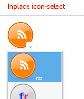
Again, the CSS is the main attraction - sporting the same IE workarounds:
.i-filterselect-icon {
height: auto;
}
.i-filterselect-icon,
.i-filterselect-icon .i-filterselect-button {
background: transparent none;
}
.i-filterselect-icon input {
visibility: hidden;
}
.i-filterselect-icon:hover .i-filterselect-button,
.i-filterselect-icon input:focus + .i-filterselect-button {
background: #ffffff url(../default/select/img/arrow-down.png) no-repeat center 10px;
border: 1px solid #eeeeee;
margin-top: -25px;
}
* html .i-filterselect-icon .i-filterselect-button {
/* IE6 does not support :hover on div */
background: #ffffff url(../default/select/img/arrow-down.png) no-repeat center 10px;
border: 1px solid #eeeeee;
margin-top: -25px;
}
As you probably noticed, the code samples are not complete; the full source can be found here.
The CSS is complete, though, and that might be all you need - there is nothing particularly complicated going on in javaland...
1 comment:
Great work Marc! These patterns are really usable in all kinds of applications, and they're applicable to other frameworks than IT Mill Toolkit as well.
Post a Comment